Earlier this year, I took some time to reflect on my career and became interested in the concept of personal branding, the intentional, strategic practice of defining and expressing who you are professionally. I identified my brand as:
- Who I am: A NYC-based software engineer motivated by building systems that model and solve complex problems at scale, whose work spans from building autonomous systems and optimization models at an R&D company to full-stack product ownership at an early-stage startup.
- How I work: Naturally curious and creative, drawn to understanding how and why things work, not just making them work. I prioritize being straightforward, low-friction, and easy to work with, and I’m comfortable owning engineering objectives end to end.
- What motivates me: Working with smart people to solve difficult problems.
- My strongest asset: Learning new content quickly, or taking feedback and applying it immediately.
With that identified, I turned my attention to rebuilding my online portfolio to match it.
Step 1: Define the audience
I started by thinking carefully about who this site is actually for, and landed on two distinct audiences. The primary one is myself — the site exists first as an up-to-date, shareable record of my professional and academic work. The secondary audience is anyone who stumbles across it: a recruiter, a future collaborator, a friend, or a family member. Most of them won’t need the granular detail, so the site also needs to support a reader who just wants to skim my experiences.
Step 2: Set design objectives
I collected a list of my favorite online portfolios, from an OpenAI co-founder to a creative technologist, and looked for patterns in what drew me to each:
- Skimmability above everything. The best sites let you understand the full picture without reading a single paragraph. Projects presented as tiles, detail accessible on click, nothing flooding the main view.
- Restrained color palettes. Most used a tight system: light background, one accent color, neutral text. Nothing overly decorative; form over function.
- Technical and mathematical visuals as texture. Charts, geometry, generative patterns, used sparingly as background detail, not spectacle.
- Typography doing most of the work. Strong hierarchy, generous whitespace, clear structure. No flashy UI elements compensating for weak layout.
These patterns became my design objectives.
Step 3: Pick an aesthetic
With my design objectives defined, I needed to translate them into an actual visual direction. I had a specific idea in mind: use a different UI container per content type to reflect both the analytical and creative characteristics in my brand, keeping the overall design clean and readable while giving the reader visually distinct things to look at.
I prompted a chatbot with my personal branding statement and the design characteristics I had aggregated, asked it to generate 10 distinct visual concepts, and picked the one that resonated most.
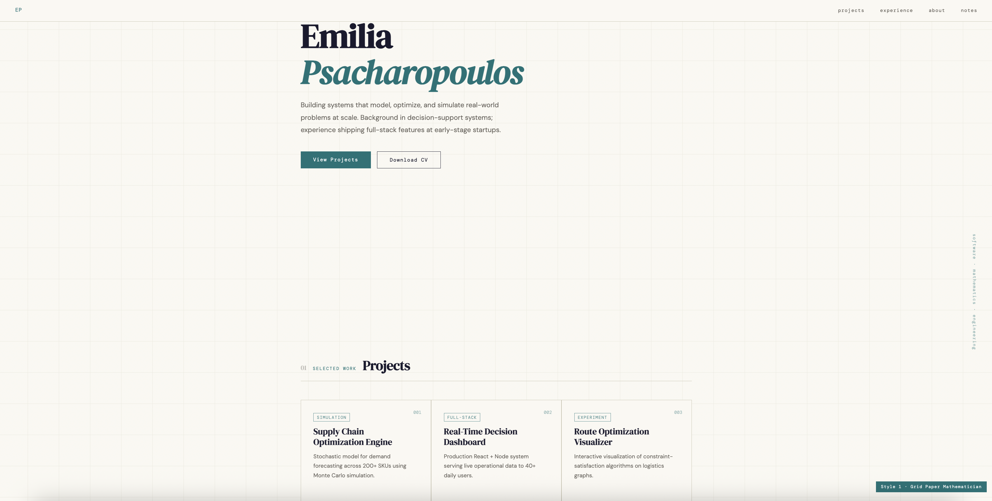
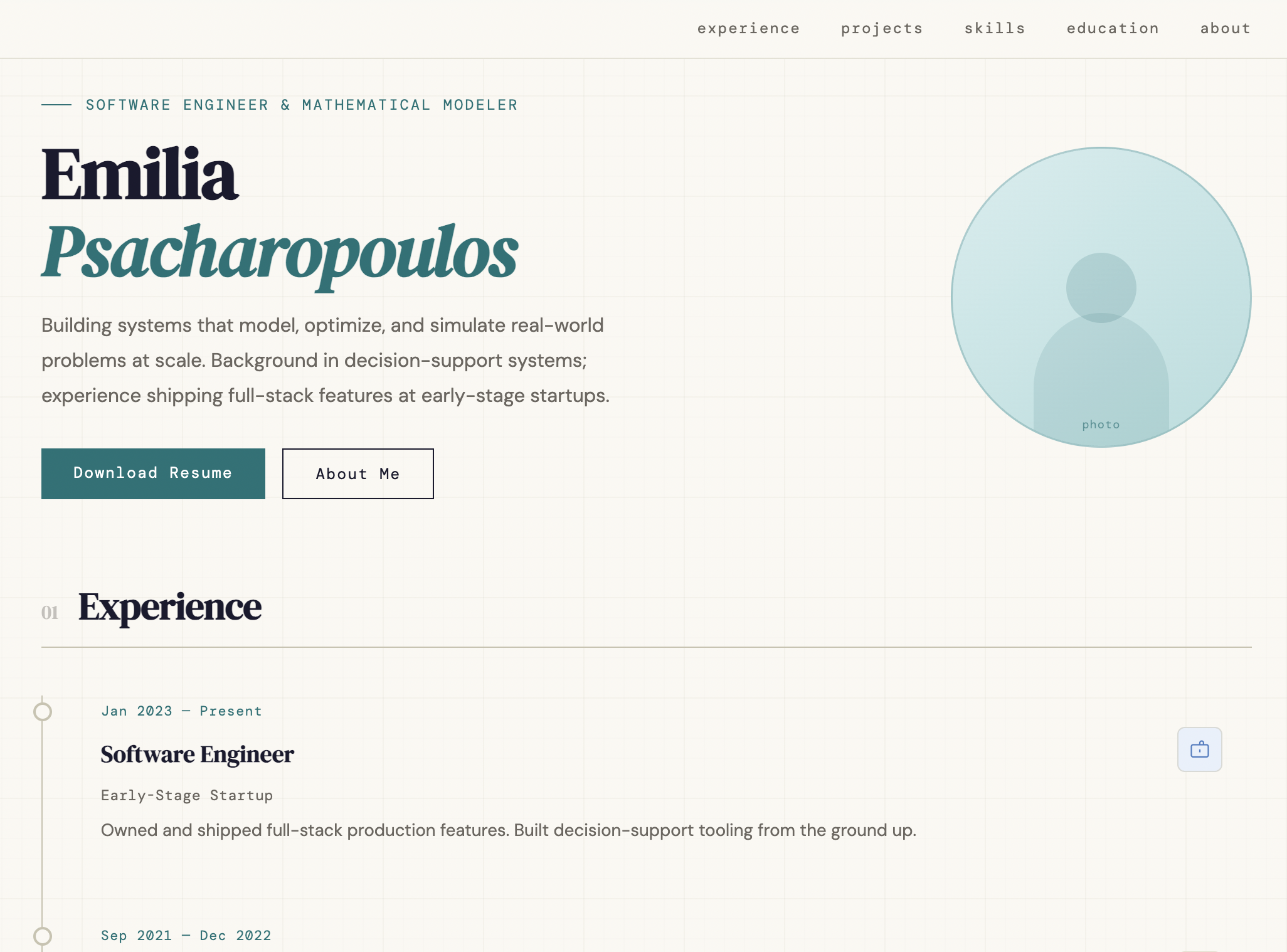
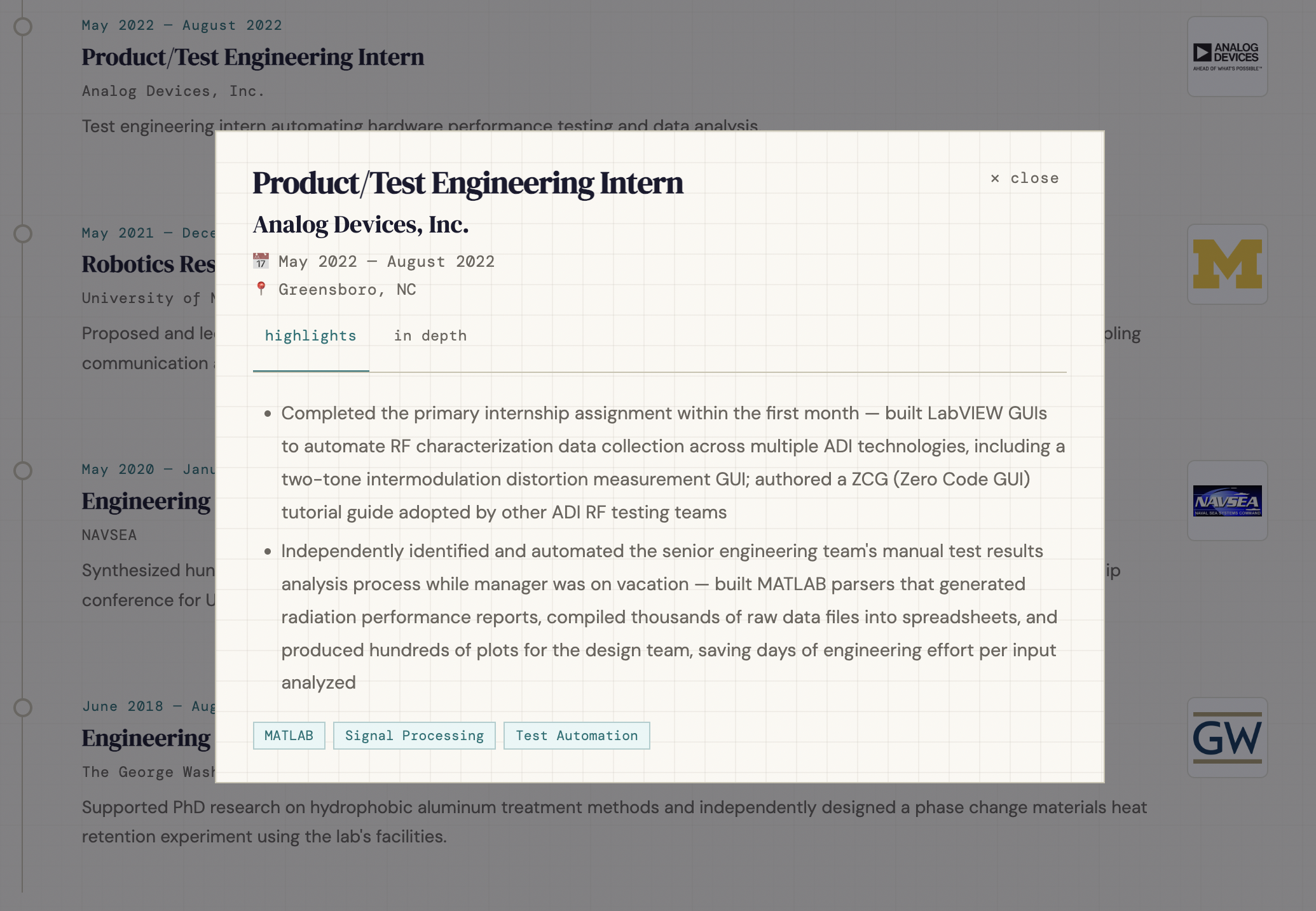
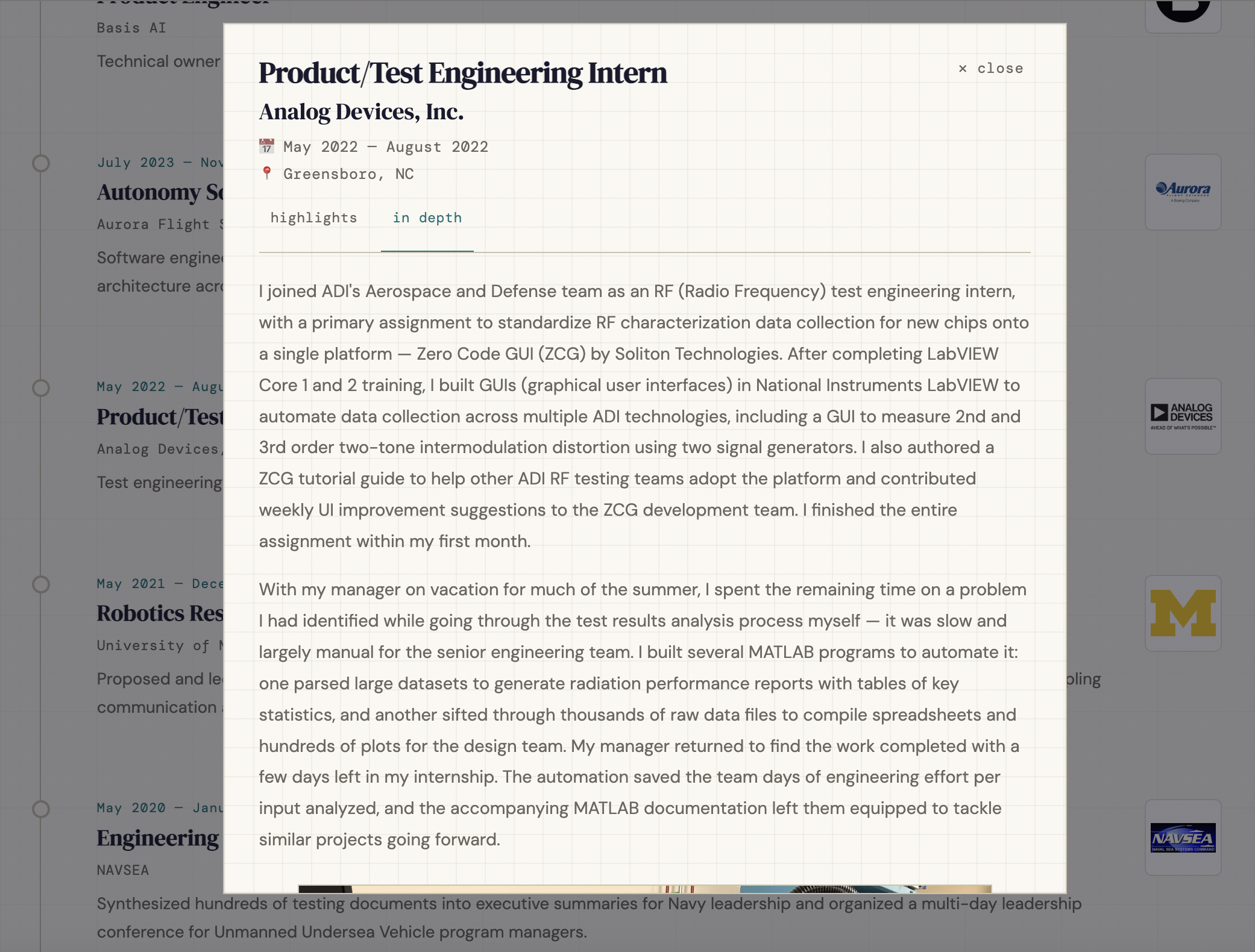
From there I refined the aesthetic and organization aggressively. For example, I introduced popup modals for projects and experiences to keep the main view clean while preserving full access to the content beneath, added a timeline layout for experiences, and added image previews to the project and experience cards on the main page. By the end of that process, I had a complete HTML draft for the home page.
Step 4: Make engineering decisions
With a clear aesthetic direction, I turned my attention to how I wanted to build it. I went in with a few core engineering principles:
- No duplicated content. No piece of content should ever exist in more than one place in the codebase.
- Content and structure are separate. Content lives in data files; HTML defines how it is presented.
- Persistent agent context. My personal preferences, coding standards, and branding decisions should be encoded somewhere permanent so I never have to re-explain them to a coding agent mid-session.
Those principles translated into concrete decisions:
Encoding my standards before writing any code. Before touching the codebase, I created a set of configuration files that a coding agent reads at the start of every session:
CLAUDE.mdis the master config. Sets coding standards, UX constraints, and one meta-rule: if I give an instruction that contradicts anything in it, the relevant file gets updated immediately so future sessions inherit it..claude/writing-style.mdencodes my desired prose style for any writing that an agent does in this repository..claude/content-philosophy.mdencodes my personal brand, design decisions, and content structure rules for any design or layout decisions an agent makes.
Content in YAML. All meaningful content (names, taglines, descriptions, project entries) lives in YAML data files. Updating anything means changing one file, not hunting through HTML.
Formatting in CSS, structure in HTML. Styling lives in a single CSS file. HTML files define page structure and loop over YAML to render components — no hardcoded content, no inline styles.
Dynamic behavior in JavaScript. A single JS file handles everything interactive: modals, URL routing, navigation, and cursor behavior. The static content is fully readable without it.
Built statically with Jekyll, served via GitHub Pages. Jekyll processes every YAML file and HTML template at build time and outputs pre-rendered HTML. The practical consequence: AI agents and crawlers can parse the full site, since they don’t execute JavaScript.
Step 5: Populate the content
With the engineering foundation in place and a fully styled shell to work from, I used Claude Code to migrate all existing content from the old site into the new design.
The bigger challenge was the writing. A lot of my existing descriptions didn’t match the personal brand I had defined, so I spent time rewriting them and working with a chatbot to refine the edits while keeping my voice intact.
I decided to implement a split-view across all experiences and projects, where a reader can toggle between short-form and long-form views of the same content. The short-form view is the default, supporting skimmability for the secondary audience identified above; the long-form is opt-in, preserving the detail that serves me as the primary audience.
The result
The site now does exactly what I set out to build. It is easy to skim, visually interesting, and reflects how I actually think about my work. Every design decision traces back to either the audience definition or the personal brand I identified at the start. The engineering decisions made it easy to maintain and extend without duplicating effort. And the content (both short and long form) is exactly what I wanted to have in one place.
If you’re rebuilding your portfolio, start with your brand before your layout. Visual and engineering decisions are a lot easier to make once you know what you’re trying to communicate.